Themes
A theme owns the entire visual representation: the palette (per-role ANSI style codes), the glyphs (marker, caret, scroll indicators, separators - each a Unicode/ASCII pair) and how every row is composed. DefaultTheme implements all of it with a neutral base; a concrete theme extends it and overrides only what it wants to change. The ThemeManager turns a theme name into an instance.
Built-in themes
Six themes ship built-in, each selectable by name:
use DrevOps\Tui\Builder\Form;
use DrevOps\Tui\Tui;

$tui = (new Tui(Form::create('My form')))->theme('midnight');
| Name | Palette |
|---|---|
default | Cyan accents on a neutral base - the out-of-the-box look. |
midnight | Violet accents, green values, pink highlights. |
frost | Arctic frost-blue accents, sage values, sand highlights. |
ember | Burnt-orange accents, olive values, gold highlights. |
mono | Hue-free - bold weight, gray levels and reverse video, for maximum compatibility. |
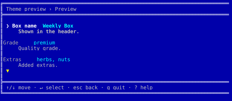
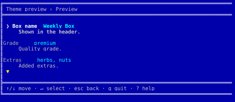
dos | Retro MS-DOS - the bright white/cyan/yellow CGA palette in a double-line window, painted on its own blue screen. |
The colorful themes use 256-color palettes, mono the grayscale ramp and dos the classic 16-color CGA set. Every one renders across all widgets and degrades to plain text when color is off. An unknown theme name fails loudly, so a typo never silently lands you back on the default.
Each adaptive theme below is shown in four looks: the dark and light palettes, each rendered once inside the default rounded border and once with the frame explicitly stripped (['border' => 'none']). Every adaptive theme has a runnable script in playground/09-themes-*.
midnight
| Dark | Light | |
| Borderless | 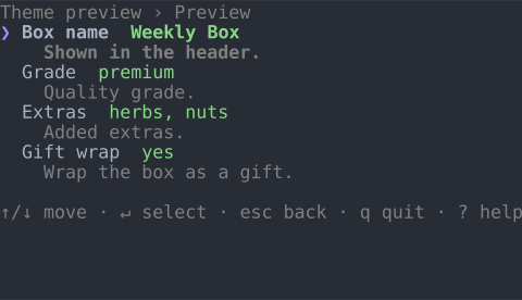 | 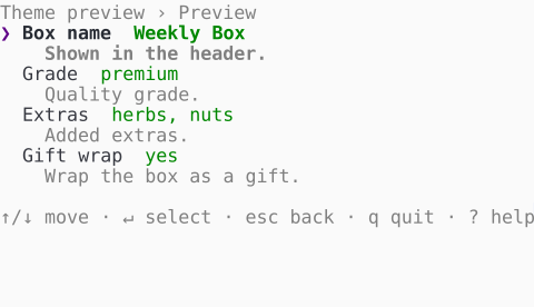 |
| Bordered | 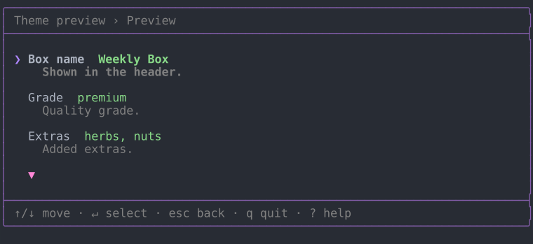 | 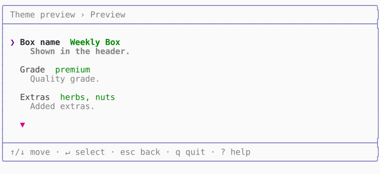 |
frost
| Dark | Light | |
| Borderless | 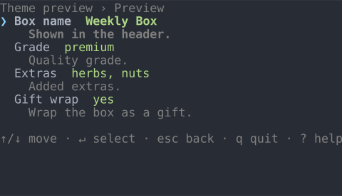 | 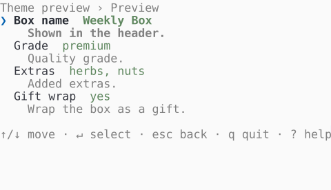 |
| Bordered | 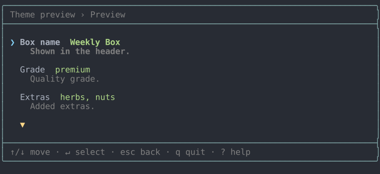 | 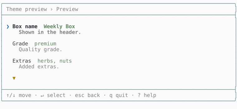 |
ember
| Dark | Light | |
| Borderless | 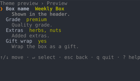 | 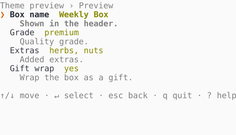 |
| Bordered | 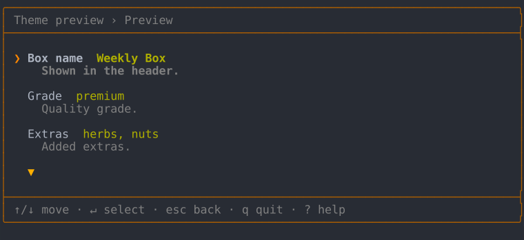 | 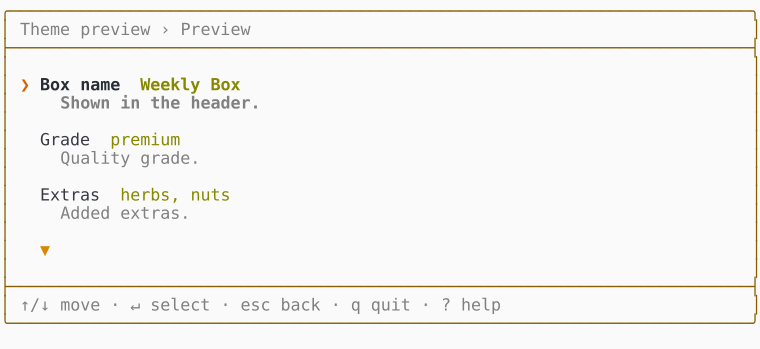 |
mono
| Dark | Light | |
| Borderless | 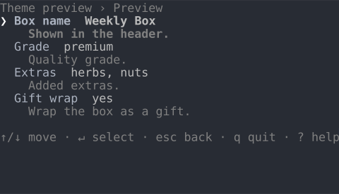 | 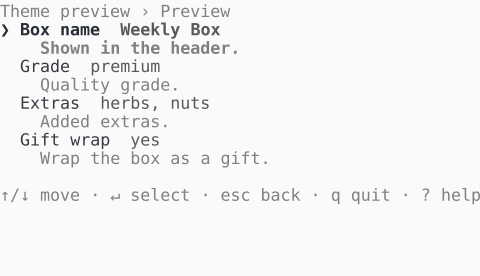 |
| Bordered | 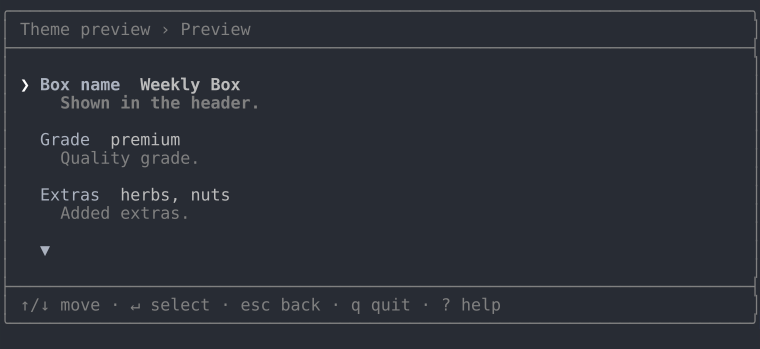 | 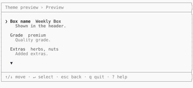 |
dos
The CGA blue screen, painted regardless of the terminal background. The theme draws its own double-line window, so there's no bordered/borderless split - the window is its frame:
Dark and light
Dark and light aren't separate themes - they're a mode display option that every theme honors. When no theme is set (or you pass the explicit 'auto' sentinel), the interactive TUI picks the mode from the actual terminal background: it queries the background color over OSC 11, falls back to the COLORFGBG environment variable, and settles on dark when neither answers.
(new Tui($form))->theme('frost', ['mode' => 'light']);  // force light
(new Tui($form))->theme('frost');                        // auto-detect
Writing a theme
A custom theme subclasses DefaultTheme and declares its palette by overriding the appearance atoms it wants to change - title(), value(), marker(), border() and so on. Each atom returns its text wrapped in an ANSI style code with paint(); every role you don't mention keeps the default, including the dark/light mode.
use DrevOps\Tui\Theme\DefaultTheme;
use DrevOps\Tui\Theme\Sgr;

class AquaTheme extends DefaultTheme {
  public function title(string $text): string {
    return $this->paint($this->isDark ? Sgr::of(Sgr::Bold, Sgr::Cyan) : Sgr::of(Sgr::Bold, Sgr::Blue), $text);
  }

  public function value(string $text, bool $selected = FALSE): string {
    return $this->paint($this->emphasize($this->isDark ? Sgr::of(Sgr::Sky) : Sgr::of(Sgr::Cobalt), $selected), $text);
  }
}
Colors come from the Sgr palette map - named cases like Sgr::Cyan or Sgr::Sand, composed with Sgr::of(...) - so a palette reads as colors rather than raw ANSI numbers.
Override as many atoms as the palette needs. For reference, the built-in themes each redeclare the accent-colored atoms (title(), highlight(), marker(), radio(), caret()) plus value(), indicator(), highlightMatch() and border(). To change how an element is laid out rather than colored, override a render*() method instead.
The lowest-friction route: name the class directly on the facade, no registration needed:
$tui = (new \DrevOps\Tui\Tui($form))->theme(AquaTheme::class);
Or register a short alias with ThemeManager::register('aqua', AquaTheme::class), then ->theme('aqua'). The playground's ocean theme goes further, overriding many atoms and render*() methods for a distinct look with a start banner: